
The journey of one of the largest aerospace giants started with one man. The company was found in 1916, by William E. Boeing, a woodsman with a passion for aircraft. Boeing established the firm in Seattle and soon, together with a team of professional engineers, designed and built his first B&W Seaplane. After switching to delivering mail in 1928, the company got itself its first logo. Boeing emblem went through different stages of updates until it eventually got its current look.
What connects Native American people and the first Boeing logo?
Visually, the logo resembled winged totem poles ꟷ an element often found in Native American culture.
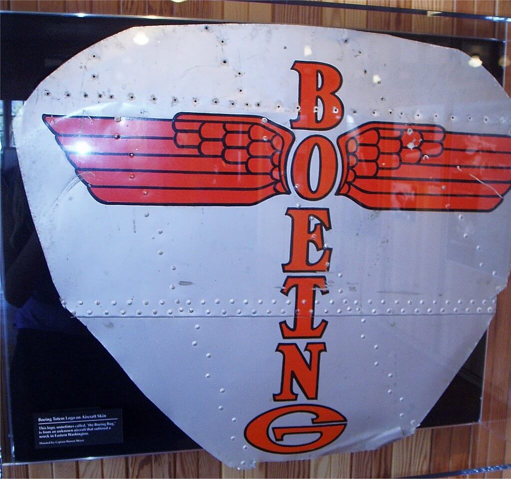
The Boeing Company was actually located on the northwestern coast, an original inhabitant of Native Americans, which makes this legend that the logo was inspired by the culture quite realistic. Later named the Winged Totem, the emblem could be spotted on all Boeing planes.
One of the most visually recognizable trademarks
After World War II, under its new leadership, Boeing made a smooth transition into commercial aviation. The aircraft manufacturer acquired its new logo, a simple and straightforward statement of its name. The current Boeing logo can be unmistakably identified by its original font, which was introduced in the same period.
Finding the right logo took some time. In 1947, two Boeing artists set up to design a durable trademark capable of lasting for years. Artists Keith Kinsman and Bob Lally put together a 10-page proposal for creating a new logo, which had to maintain its original visibility, style, and color. The new logo stood out thought its Stratotype font. As seen in initial sketches from the Boeing archives, the unique typeface featured squared-off letters that resembled airplane windows. The angled letters gave an enduring sense of motion. The Stratotype alphabet numbers were used in airplane identifiers such as the name of the model 377 Stratocruiser, which made its first flight in 1947. The Stratotype logo was soon placed on fuselages, advertisement booklets, and posters. In 1988, Boeing limited use of its logo use, which nowadays is protected by copyright from any kind of infringement.
The Stratotype logo was a literal representation of Boeing for more than 50 years. The classic brand was updated in 1997, after the aerospace giant merged with its competitor McDonnell Douglas. Designer Rick Eiber was inspired by the classic McDonnell Douglas logo, which was in turn derived from the Douglas Aircraft logo. The new brand combines a streamlined version of the McDonnell Douglas symbol and 1947 version of the Boeing logo. It continues to portray the essence of the company in any language and its legendary slogan “Building Something Better”. The Stratotype alphabet is now exclusively reserved for the Boeing logotype and the alphanumeric designators on Boeing aircraft.